Your Session Styling Guide
A practical guide to choosing outfits that feel like you and photograph beautifully.
A quick note before we dive in: these aren't rules. They're simply the things I've learned after photographing hundreds of sessions. If something doesn't fit your personality or style, we'll adapt it. My goal isn't to make you look like everyone else—it's to help you look like the best version of yourself.
Let’s Talk Wardrobe
Let's be honest, figuring out what to wear is hard enough on a normal day. Throw in family members, partners, dogs, a photoshoot, and suddenly you're questioning every single thing hanging in your closet.
If that's where you're at right now, don't worry. You're definitely not the only one.
That's exactly why I put this guide together.
✦
Everything you'll find here is based on things I've learned after years of photographing hundreds of sessions. None of it is meant to be a list of rules you have to follow. Think of it more as guidance. These are the little things that make a bigger difference than most people realize and help your photos and gallery feel cohesive, natural, and true to you.
At the end of the day, I don't want you wearing something because a style guide told you to. I want you wearing something that feels like you, just with a little extra intention behind it. When you're comfortable and confident in what you're wearing, it shows, and that makes such a difference in your final gallery.
And one more thing… I genuinely want this process to feel collaborative. If you're deciding between two dresses, wondering if a color works, or have an entire shopping cart waiting for a second opinion, send it my way! Helping clients style their sessions isn't an extra favor, it's part of my job, and it's one of my favorite parts of the planning process. The more we work together beforehand, the more relaxed and confident you'll feel when session day arrives.
The Five Principles
Before we dive into colors, patterns, shoes, and all the little details, I want to share the five things I come back to every single time I'm helping a client choose outfits.
If you remember nothing else from this guide, remember these. They're the foundation for everything that follows, and they'll help make almost every wardrobe decision a little easier.
Comfort Comes First
This is always my number one rule.
If you're constantly adjusting your shirt, tugging at a dress, breaking in new shoes, or worried about something feeling too tight, it'll be hard to relax and enjoy your session. The best photos happen when you're focused on the people (or pups!) you're with, not your outfit.
Choose something you'd actually enjoy spending an hour walking, sitting, and moving around in.
Coordinate, Don't Match
Gone are the days of everyone wearing the exact same white shirt and jeans.
Instead, think about choosing outfits that feel like they belong together. Mixing complementary colors, textures, and layers creates much more natural, timeless photos than everyone wearing the exact same thing.
We'll dive into exactly how to do that later in this guide.
Dress for the Setting
One of the easiest ways to make your photos feel cohesive is choosing outfits that fit the location.
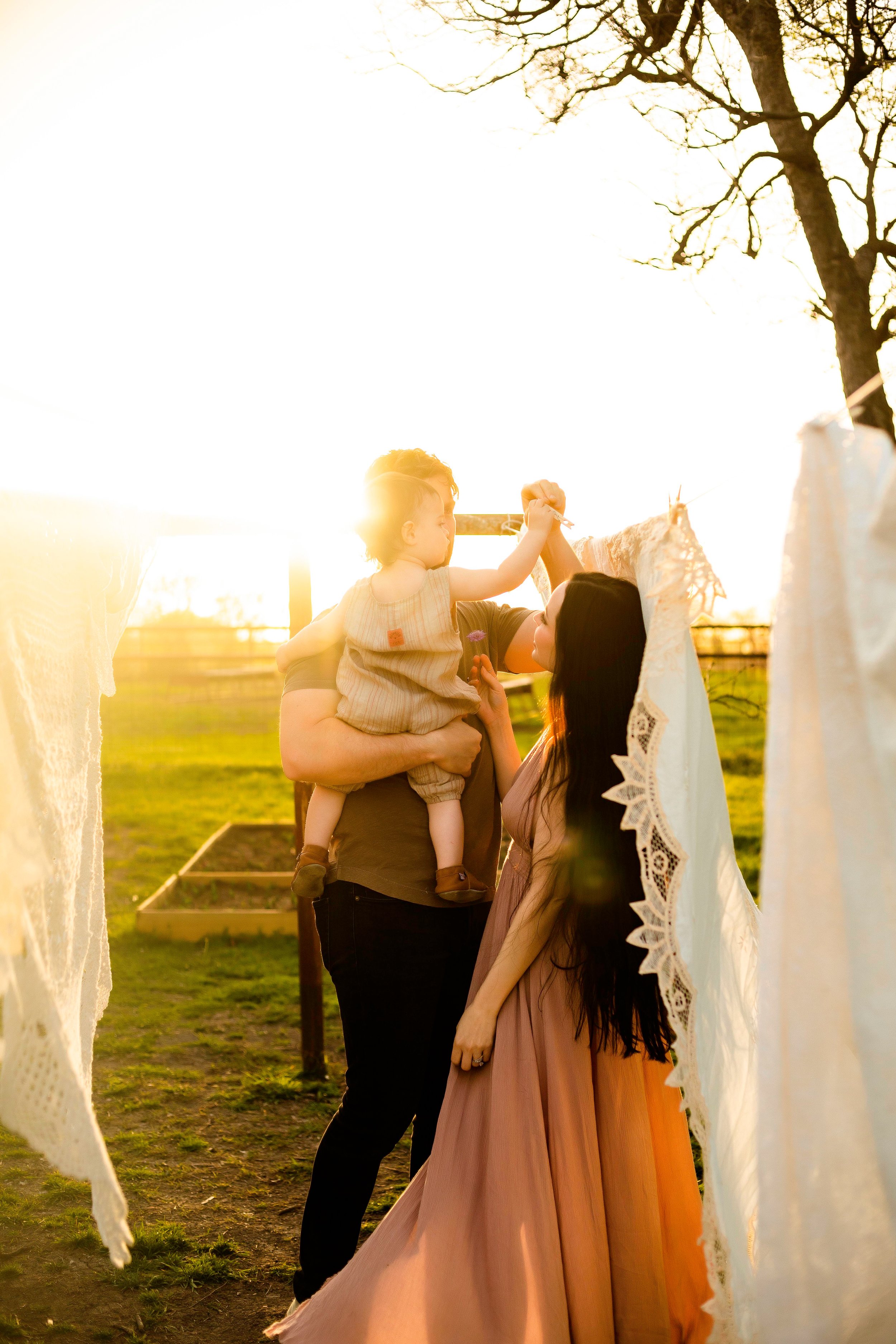
A flowy dress at the beach feels different than one in the middle of downtown, just like hiking boots make more sense in the forest than on a rooftop. When your wardrobe complements your surroundings instead of competing with them, everything comes together naturally. [This is exactly what "Dress for the Setting" looks like in action.]
Think in Color Palettes, Not Individual Outfits
One outfit might look amazing on its own, but sessions almost always look better when everyone's clothing works together.
Instead of choosing each outfit separately, lay everything out together on the bed or floor. Looking at the whole picture makes it much easier to spot colors that clash or pieces that feel out of place.
Wear What Feels Like You
Trends come and go, but your photos should still feel like you years from now.
If you never wear dresses, don't feel like you need one for your session. If you're happiest in boots instead of sandals, wear the boots. The best outfit is one that feels true to your style.
Start With the Setting
Before you start picking outfits, I always recommend thinking about where your session is happening and what time of year we're photographing it.
Your location is already bringing a lot to the table – the colors, textures, lighting, and overall feeling of the space. The goal isn't to match your surroundings exactly, but to choose outfits that feel like they belong there.
An outfit that works beautifully in one location might feel completely out of place somewhere else, and that's where being intentional can make a big difference.
Think about your location like the backdrop for your story. Your outfits should complement it, not compete with it.
Below are some examples of how different settings can inspire your wardrobe choices. These aren't rules, just ideas to help you visualize what works well together.
Field Locations
Fields are naturally soft, open, and romantic. They tend to pair beautifully with outfits that have movement and texture—think flowy dresses, linen shirts, lightweight layers, and fabrics that catch the breeze.
Colors that work well:
Warm neutrals, soft greens, creams, dusty blues, muted pinks, earthy tones, and subtle floral patterns.
Textures to consider:
Linen, cotton, crochet, knit sweaters, denim, and flowy fabrics.
Think: effortless, relaxed, and a little whimsical.
Forests & Wooded Locations
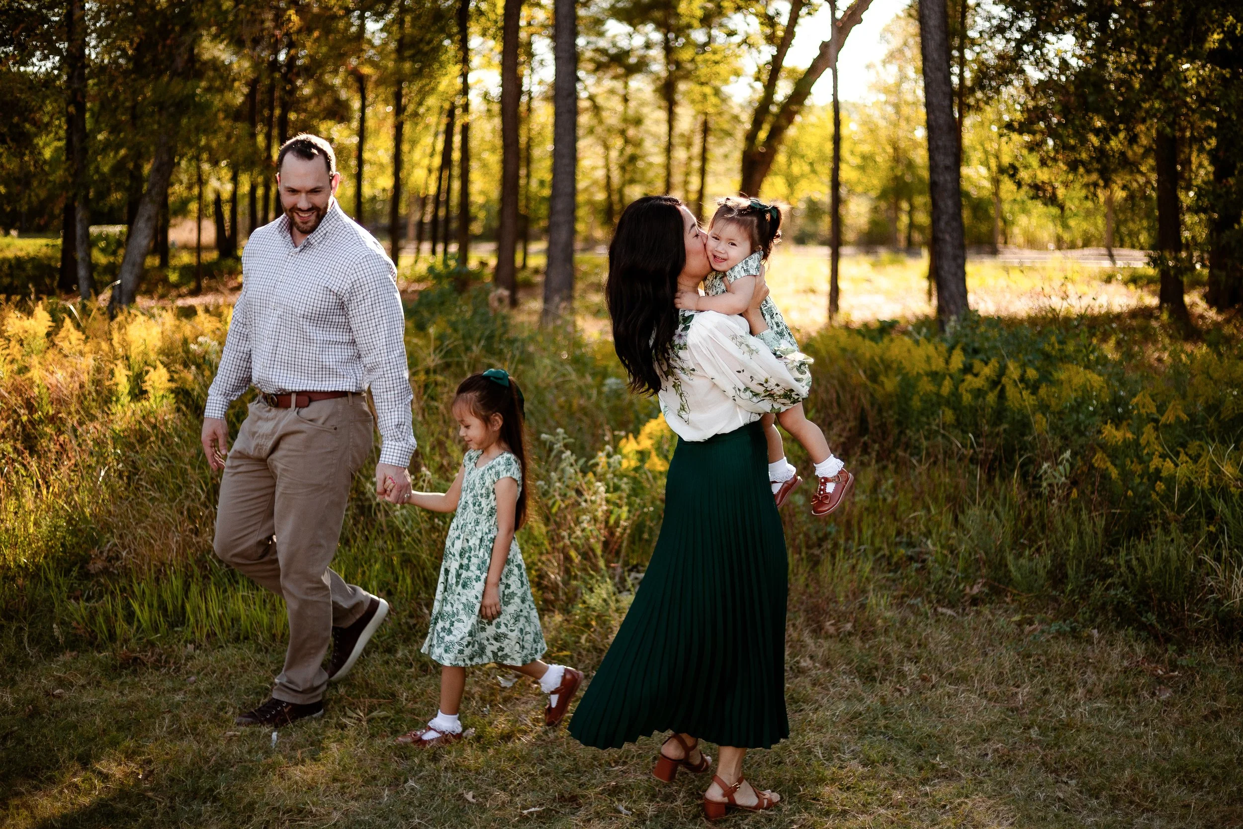
Forests are full of texture, depth, and natural colors, which makes them a great place to lean into earthy tones and cozy layers.
Colors that work well:
Olive, rust, mustard, cream, brown, charcoal, deep blues, and warm neutrals.
Textures to consider:
Chunky sweaters, denim, corduroy, flannels, jackets, boots, and layered pieces.
Think: cozy, adventurous, and connected to nature.
Beach Locations
Beach sessions naturally lend themselves to lighter fabrics, relaxed silhouettes, and outfits that allow you to move comfortably.
Colors that work well:
Creams, whites, soft blues, sandy neutrals, sage, muted greens, and warm tones inspired by sunset.
Textures to consider:
Linen, cotton, gauze, flowy dresses, lightweight button-downs, and barefoot-friendly outfits.
Think: relaxed, playful, and effortless.
Urban Locations
City sessions give you a chance to have a little more fun with structure, contrast, and personal style. The textures of buildings, sidewalks, and architecture can pair beautifully with outfits that feel a little more polished.
Colors that work well:
Black, neutrals, denim, jewel tones, monochromatic outfits, and bold accent colors.
Textures to consider:
Leather jackets, structured coats, denim, sleek dresses, boots, and modern layers.
Think: confident, stylish, and uniquely you.
Creeks & Water Locations
Water locations have a beautiful mix of soft movement and earthy textures. These settings tend to look best when outfits feel natural and comfortable enough to explore.
Colors that work well:
Earth tones, blues, creams, greens, warm neutrals, and colors inspired by the landscape.
Textures to consider:
Rolled-up jeans, linen, lightweight layers, sweaters, casual dresses, and comfortable shoes you don't mind getting wet.
Think: adventurous, playful, and a little spontaneous.
At-Home Sessions
At-home sessions are all about comfort, connection, and the little moments that happen in your everyday space.
The best outfits usually feel like elevated versions of what you already wear at home. Think cozy, comfortable, and easy to move in.
Colors that work well:
Neutrals, soft earth tones, muted colors, and shades that complement your home's existing colors.
Textures to consider:
Knit sweaters, cozy cardigans, linen, cotton, pajamas, barefoot moments, and soft layers.
Think: authentic, relaxed, and completely you.
Color Theory
Why Color Matters
Color is one of the first things we notice in a photograph, even if we don't realize it. The colors you choose can completely change the feeling of an image.
When choosing outfits for your session, the goal isn't for everyone to wear the exact same colors. In fact, that can sometimes make photos feel a little flat. Instead, think about choosing colors that work with each other.
The sweet spot is coordination, not matching.
A family or couple wearing different shades, tones, and textures creates more visual interest while still feeling connected. Think of it like putting together a room in your home – you wouldn't want every piece of furniture to be the exact same color, but you also wouldn't want every item competing for attention.
The same idea applies to your outfits.
Building a Color Palette
One of my favorite ways to approach wardrobe planning is to think about a color palette instead of choosing individual outfits.
Start by picking one person's outfit first. This is especially helpful if someone has a dress, outfit, or piece they already love and want to build around. Once you have that starting point, the rest of the outfits can pull colors, tones, and textures from that piece without everyone looking overly coordinated.
From there, think about adding:
✧ A main color — the color that sets the overall tone
✧ Supporting colors — shades that complement the main color
✧ Neutrals — colors like cream, beige, gray, brown, or black that help balance everything
✧ Textures and layers — pieces that add depth without needing more colors
A helpful trick is to lay everyone's outfits out together before your session. Seeing everything side by side makes it much easier to notice if one piece feels too bright, too busy, or doesn't quite fit with the rest.
Remember: the goal isn't for everyone to look the same. The goal is for everyone to look like they belong together.
Color Theory in Action
The color wheel is a helpful tool for understanding why certain colors naturally work well together.
Colors that sit next to each other on the color wheel (analogous colors) tend to create a soft, cohesive look. Colors that sit across from each other (complementary colors) create contrast and help outfits stand out while still feeling intentional.
For example, blue and orange, or green and red, may seem like opposites, but when used in the right shades, they can create a beautiful balance.
When choosing outfits, you don't need to follow the color wheel perfectly. Instead, use it as a guide to understand why certain combinations feel balanced and why others may compete.
A few simple ways to use color theory:
✧ Pair warm tones with other warm tones (rust, cream, olive, brown)
✧ Pair cool tones with other cool tones (blue, gray, sage, lavender)
✧ Add contrast with a complementary accent color
✧ Use neutrals to create balance
The best combinations usually feel intentional without looking like they were planned too perfectly.
Coordinating Multiple People
When you're planning outfits for more than one person, it can be tempting to make sure everyone matches. After all, matching feels easy and safe.
But the best-looking galleries usually aren't built around everyone wearing the exact same color. They're built around outfits that feel connected while still allowing each person’s personality to show.
Think of your wardrobe like a team. Everyone has their own role, but everything works together.
Here are a few ways to make that happen:
Start With One Outfit
One of the easiest ways to coordinate a group is to choose one outfit as your starting point.
This could be a dress someone loves, a partner's outfit, a favorite sweater, or even an outfit that has a color you want to build around.
From there, pull inspiration from that piece:
✧ Colors that complement it
✧ Similar tones or shades
✧ Textures that add interest
✧ Neutrals that help balance everything out
Starting with one outfit keeps everyone from shopping separately and hoping everything magically works together at the end.
Choose a Color Palette
This doesn't mean every person needs to wear one of those colors. It simply gives everyone a direction to follow.
A balanced group might include:
✧ 1-2 main colors
✧ 1-2 supporting colors
✧ A few neutrals
Remember, colors don't have to match perfectly. Different shades and tones often make photos feel more natural.
Avoid Too Much of the Same Thing
Sometimes the easiest mistake is choosing what feels like the safest option.
Everyone in black.
Everyone in navy.
Everyone in jeans and a blue shirt.
While these choices are classic for a reason, too much of the same color can cause everyone to visually blend together.
Instead, try adding variety through:
✧ Different colors within the same palette
✧ Different textures
✧ Layers
✧ Accessories
The goal isn't for everyone to stand out individually. It's for everyone to be easy to see while still feeling like they belong together.
Mix Textures and Layers
If everyone is wearing simple colors, texture is what keeps outfits from feeling flat.
A knit sweater, linen dress, denim jacket, leather boots, or corduroy pants all add visual interest without adding another competing color.
Layers are especially helpful because they give you options throughout the session. A jacket can come on or off, sleeves can be rolled, and small changes can create variety in your gallery.
Lay Everything Out Together
This is one of the easiest ways to catch things you might not notice when looking at each outfit individually.
Ask yourself:
✧ Do these outfits feel like they belong together?
✧ Is one color much brighter than everything else?
✧ Is there too much of one color?
✧ Do we have a good mix of textures?
If something feels off, you still have plenty of time to adjust.
Patterns, Prints & Finding Balance
Patterns are one of the easiest ways to add personality to your session wardrobe. They can bring in movement, texture, and a little bit of fun, especially when they reflect your personal style.
The key is balance.
A common misconception is that patterns don't photograph well, but that's not necessarily true. The right pattern can be the piece that brings an entire color palette together. The trick is making sure your patterns are working with the rest of your outfits instead of competing for attention.
Think of patterns like seasoning in a recipe. A little bit can add so much, but too many strong flavors at once can make things feel overwhelming.
Color Scheming
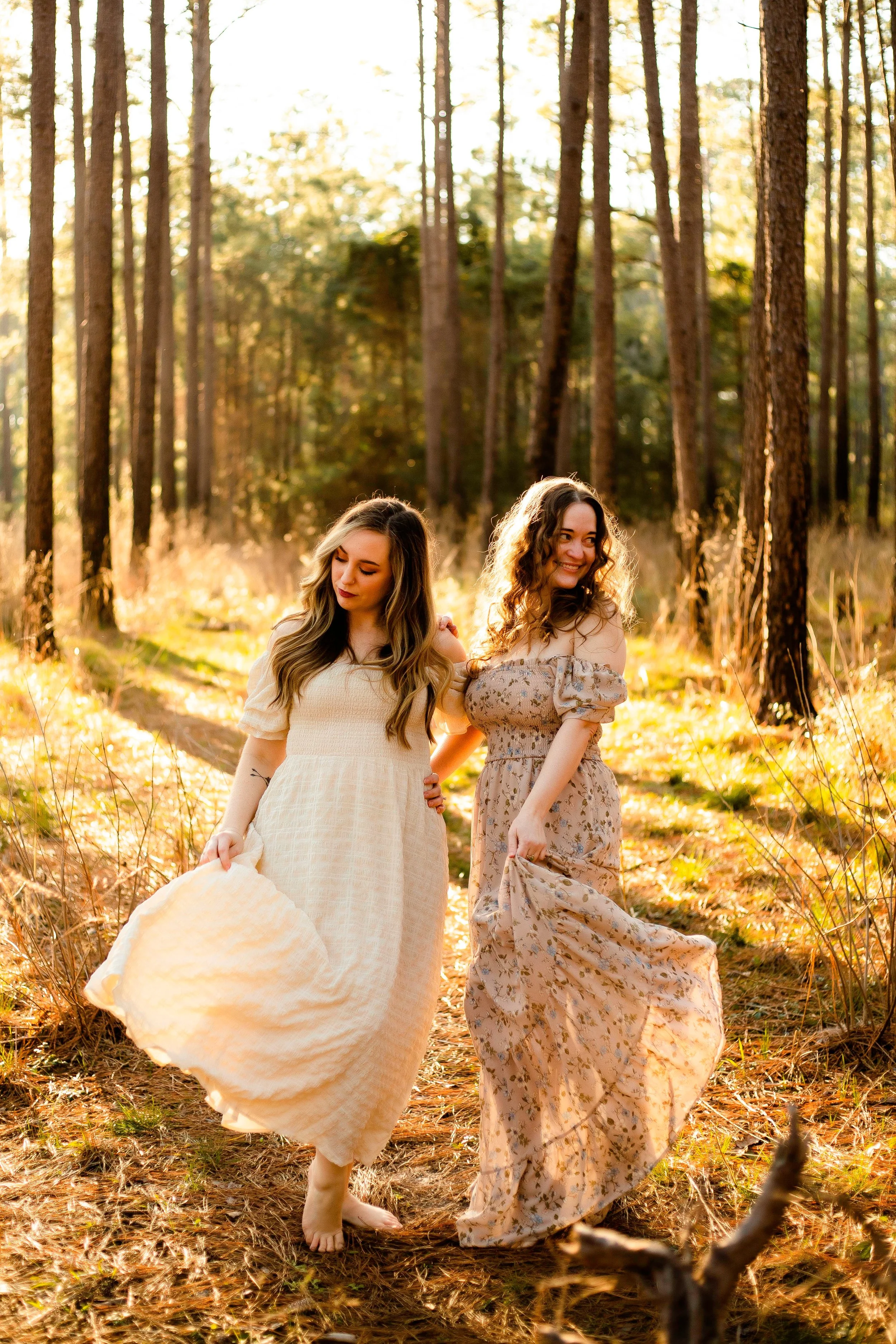
A rule of thumb here is to choose to either complement your natural environment or contrast it. A mustard-colored piece in a deep green forest will pop beautifully, whereas a neon, patterned piece doesn’t quite fit in with your surroundings. It depends on what you’re looking for!
For families it’s best to keep your color scheme limited to four colors. You can choose one person to wear a feature color/pattern and have everyone else’s outfits complement that.
Aiming for neutrals, earthy tones, and metallics is always a safe bet. These colors complement the outdoor environment almost anywhere you go and look damn fine as a printed, framed photograph.
Don’t get me wrong, I’m not advocating for a beige world of quiet and inoffensive colors. By neutrals, I just mean softer tones. Primary colors are incredibly striking, but can sometimes have the effect of detracting from the main subject (which is you).
So for example, instead of electric blue, go for something closer to sky blue. Instead of bright orange, opt for ochre or apricot.
Lead with personality
testing
Pick fabrics that move and flow with you. Ones that add a cozy texture, or get picked up by the wind, filter the late afternoon sun, and glow in the morning light. Natural fibers like linen, cotton, or wool are amazing. Avoid stiff- seeming or tight garments as they can feel uncomfortable, limit movement, and often need adjusting.
Incorporate texture & movement